Project in different classes
letter B
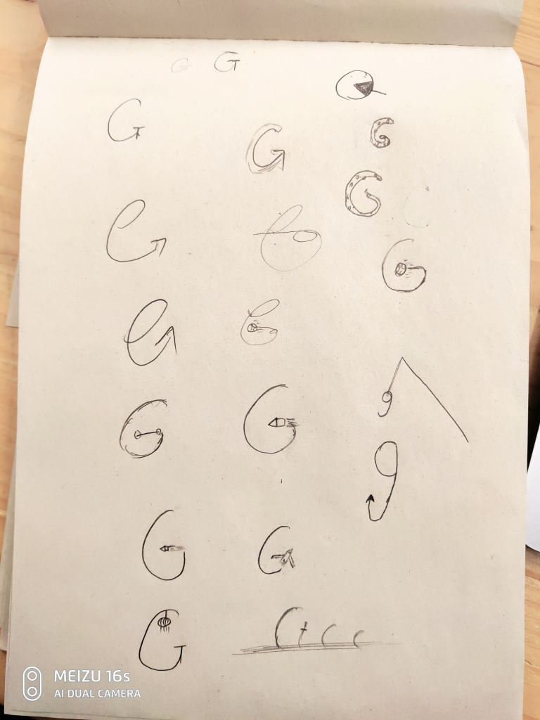
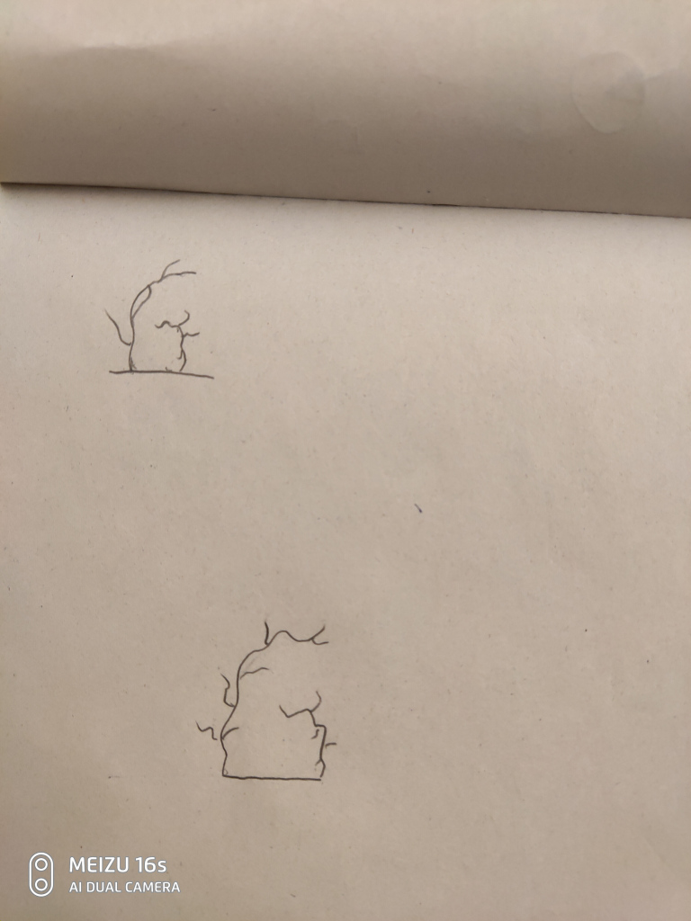
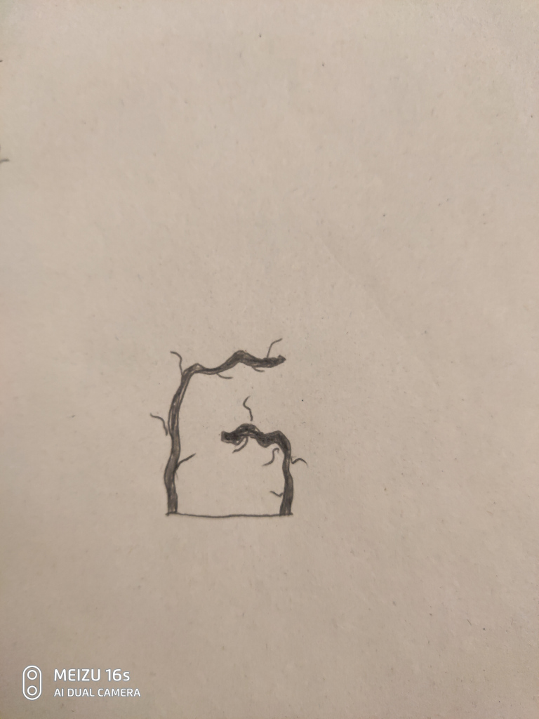
To create an illustration with the letter G, at the beginning, I chose the sans serif for the base letter. Then, I created some ideation sketches which contains some elements such as hook, gear, trace, snake. However, I finally create a sketches with a withered tree since Halloween is coming. I use the trunk of a tree to create the shape of letter G, and some branches to bring the atmosphere of horror.
Color zine
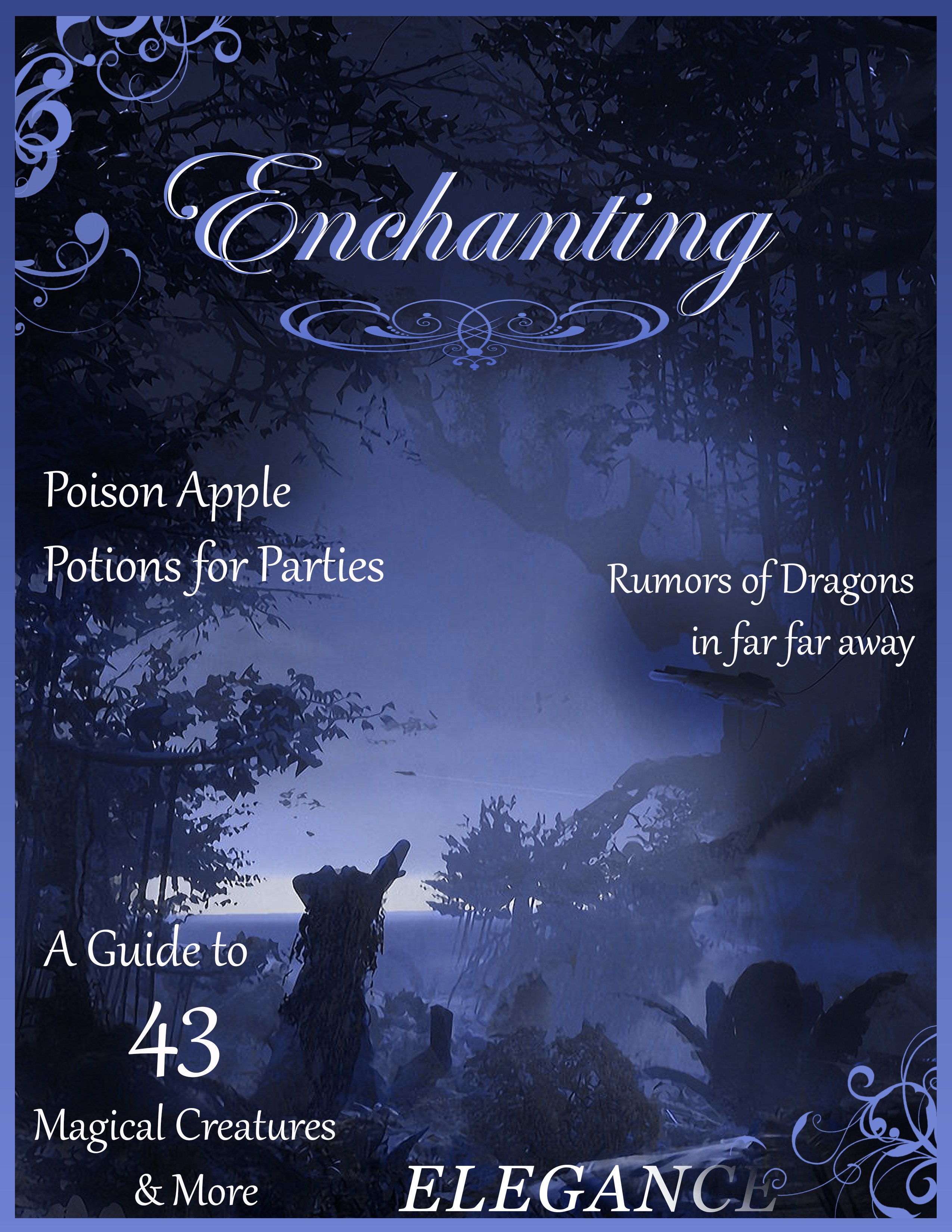
With a group of 4, we first created 10 interesting adjective words and chose one of the most interesting words which is enchanting to all of us. Then, we use the color of the adobe website to explore related colors. After that, we use photoshop to make the cover of a magazine based on color and adjective words. Then, we choose font style, font size, background image, decorate strips, to make the whole poster look united, and related to our color and title. For the title, we want to show enchanting to audience when they first look at it, so we use curlicue font style. For the key article title, we think that audience need to understand quickly so we use normal font.
Logo a Go-Go
Partner name: Kenny
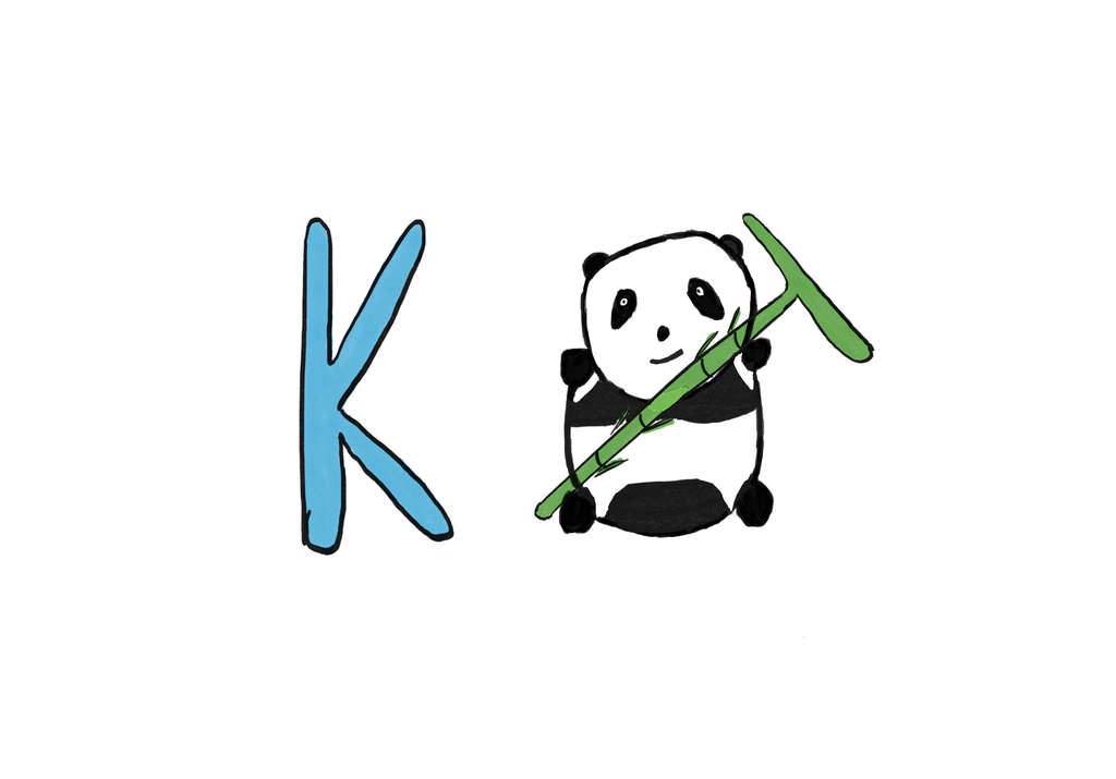
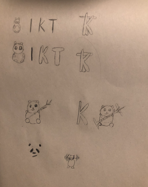
In this small project, I interviewed my partner Kenny about his favorite colors, what his hobby and what can represent him. He said he likes blue and white color in a logo, and he really likes panda. The initial of his name that he prefers is KT. So based on that information, I created several drafts, which all contained panda. He preferred one of those draft design, and gave some feedback to me. He suggested to reverse T letter so that audiences might see it clearly, and add some color to the panda.
This is my final design.
